
Primary signature
The complete feather and wordmark lockup. Use for website headers, stationery, and first introductions.
Black SVG ↓White SVG ↓Gold SVG ↓ IDENTITY & EXPRESSION / 2026Download logo suite ↗
THE BRAND BOOK / VOLUME 01
A considered identity for the art of feeling.
 PHOTOGRAPHS WITH PRESENCE.
01 / THE IDEA
Galart is a personal photography studio built around connection. The identity gives the photographs room to breathe and makes every interaction feel thoughtful, warm, and individual.
The two feather forms draw from the original Galart emblem. Refined into a single, balanced gesture, they suggest two lives coming together, a moment held, and the lightness of being yourself.
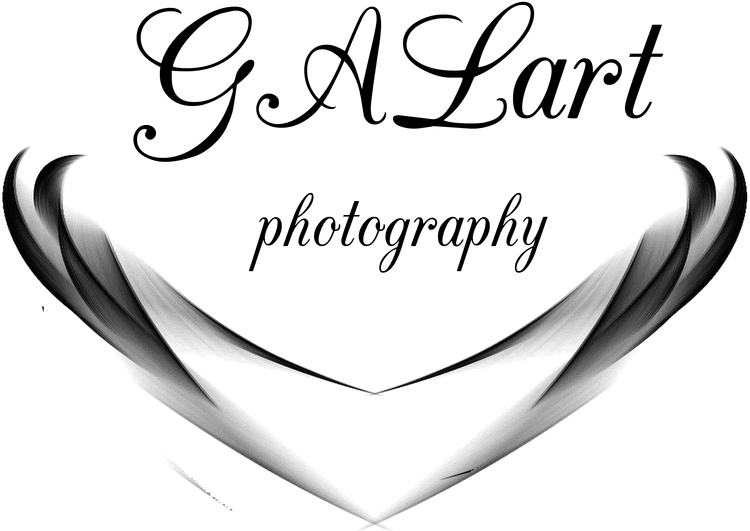 THE ORIGINAL EMBLEM
 A QUIETER, CLEARER EXPRESSION
02 / THE IDENTITY
One recognisable identity.
Three considered expressions.

The complete feather and wordmark lockup. Use for website headers, stationery, and first introductions.
Black SVG ↓White SVG ↓Gold SVG ↓
For narrow spaces, editorial signatures, and understated brand presence. Always use the outlined artwork.
Black SVG ↓White SVG ↓Gold SVG ↓
A small, recognisable gesture for favicons, packaging, watermarks, and the closing note of an experience.
Black SVG ↓White SVG ↓Gold SVG ↓Leave clear space of at least one feather-symbol height around the primary lockup. Keep the primary logo at least 140 px wide on screen; use the emblem alone below this size, at least 24 px wide.
Preserve its proportions and colour. Use the supplied vector artwork. Avoid shadows, outlines, gradients, stretching, or placing the mark over a busy face or bright detail.
Black on ivory. White on ink. Gold as a considered accent on dark backgrounds. On photography, choose a quiet area or a dark overlay that keeps the full signature legible.
03 / THE PALETTE
Select a swatch to copy its HEX value. Set body text in ink on ivory; champagne is an accent, not a small-text colour on light backgrounds.
04 / THE TYPOGRAPHY
A clear serif with substantial strokes, paired with a quiet, highly readable sans serif. The contrast creates a distinctive voice without competing with the photographs.
LORA
Regular, medium, and italic. Headlines,
story titles, and expressive moments. Use generously and with
short, intentional lines.
MANROPE
Regular and medium, with generous
text sizes. Navigation, descriptions, forms, prices, and the
details that need to be effortless to read.
Both fonts are self-hosted. Their open font licenses are included with the site.
The art of feeling.
For the fleeting moments.
And everything they mean.
05 / THE PHOTOGRAPHY
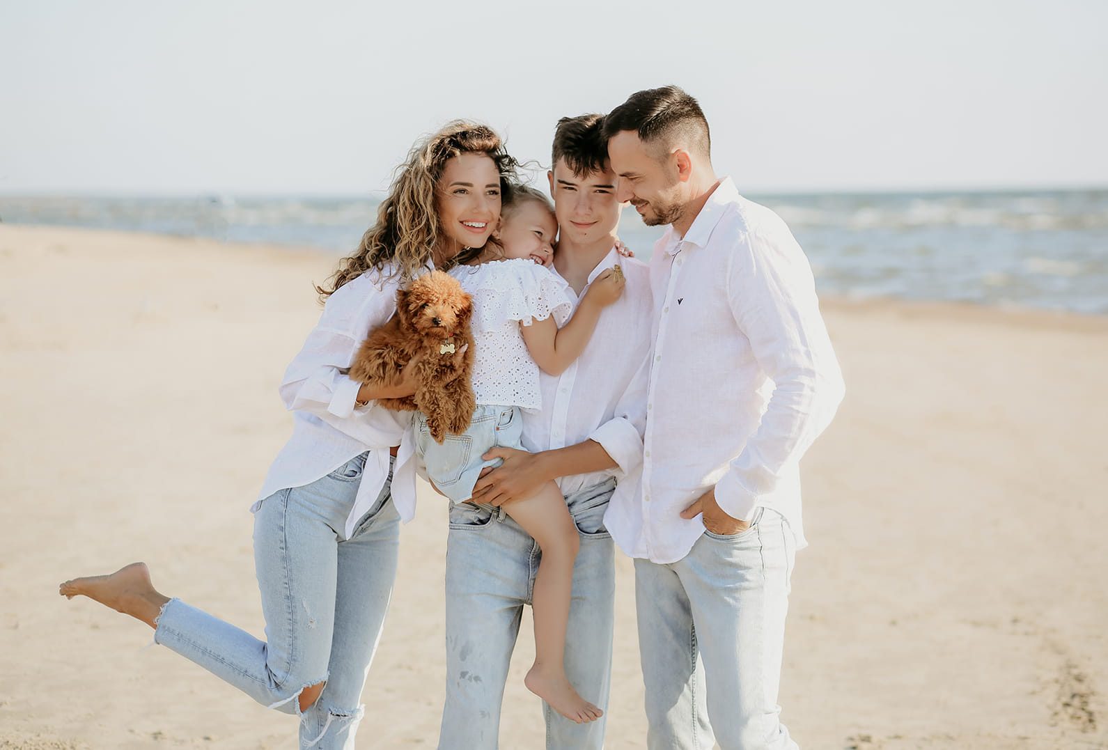
Natural connection. Thoughtful light.
The quiet details that
make it personal.
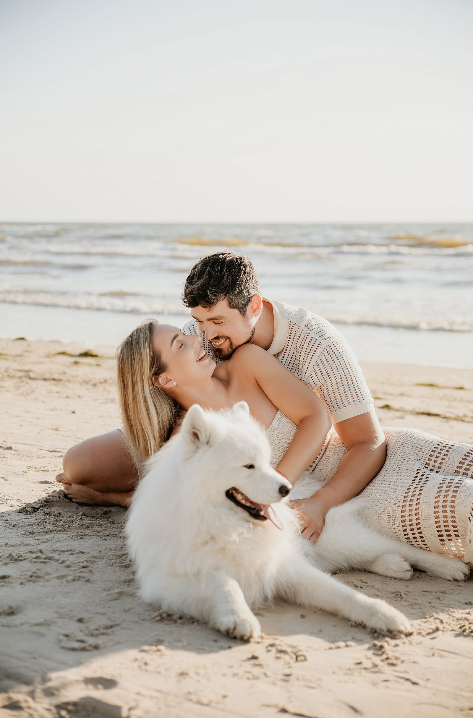
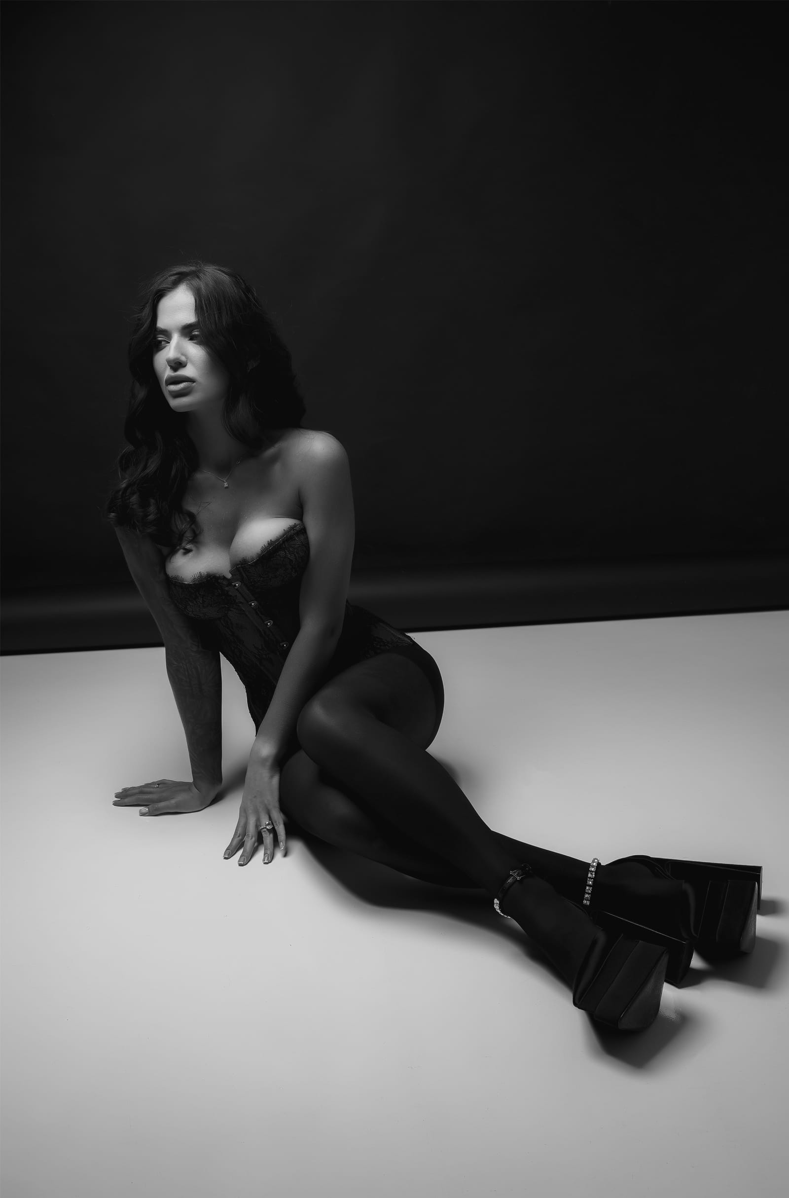
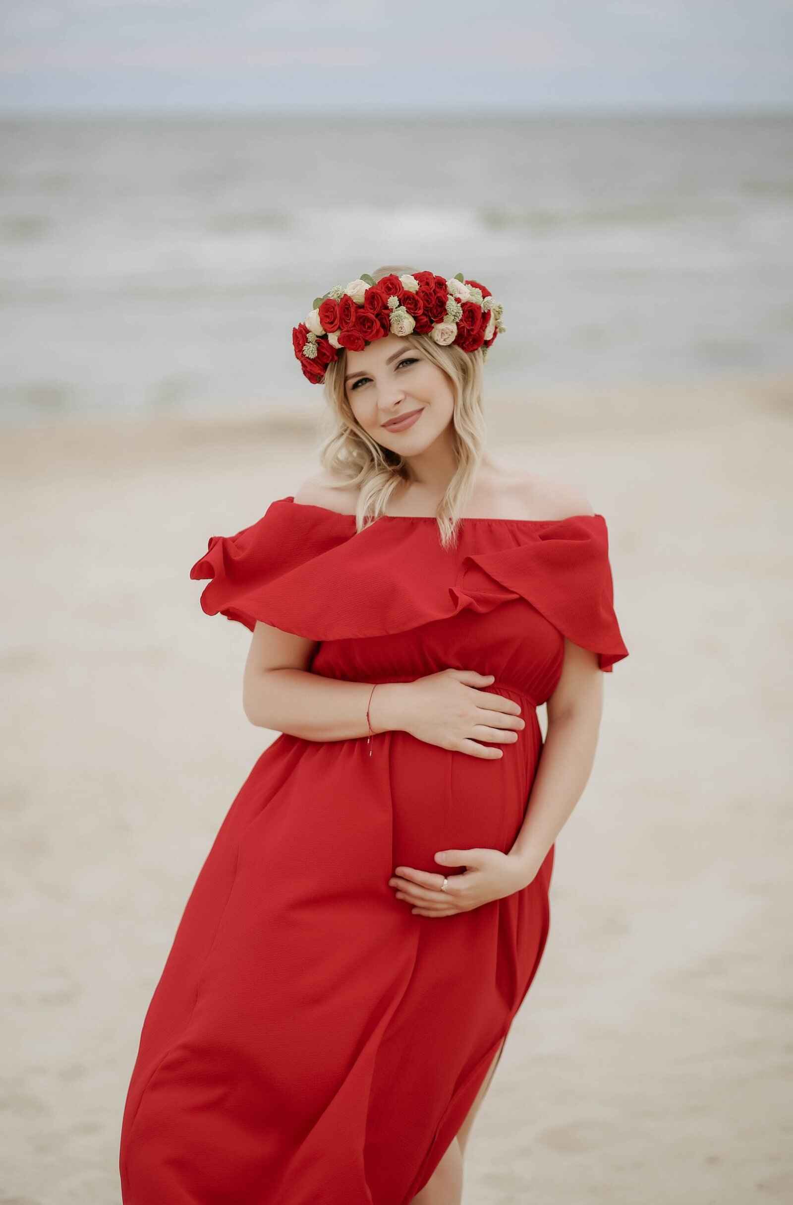
Keep faces and gestures intact. Use full-bleed images for immersion and generous margins for quieter stories. Avoid cropping through eyes, hands, or important details.
The brand palette stays restrained so the photographs can hold colour. Keep skin tones natural. Use monochrome when the story benefits from stillness and contrast.
Slideshow transitions should feel unhurried. Give every photograph seven seconds. Always offer pause and previous/next controls, and respect reduced-motion preferences.
06 / IN THE WORLD

THE VOICE
Speak to one person. Use simple language, specific details, and genuine invitations. “Let’s tell your story.” “A little time for you.” “Your moment. Your story.” Keep practical details clear: session duration, price, availability, and what happens next.
9 outlined SVG assets · black, white & champagne

